So, last time I posted some Illustrations I did for the school newspaper and I believe that I mentioned that many other Illustrations were requested of me throughout my time at that school.
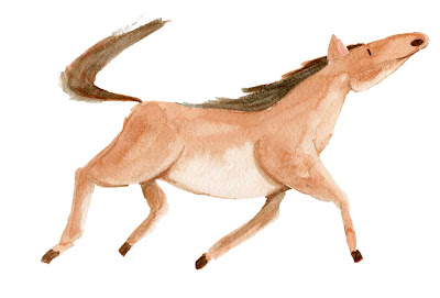
One such of those was a series of Illustrations depicting animals. The purpose of these was just to have some cards to use for naming animals in English for some Elementary school students that were visiting the middle school I was working at.
I'm not sure if it's a normal thing, but at my school, they had one day where students that would be coming to our school the following year would visit.
Actually...come to think of it, I remember doing something similar when I was in elementary school, and middle school.
Anyway, so I and a fellow teacher were put in charge of giving an English lesson to the students. Part of my responsibility was to make the cards that you will see below.
I had fun making these, though some of them could've been better. I was satisfied with most of them though.
Before leaving the school to teach at the school that I'm currently teaching at, I gave away most of these cards and the bear cards that I posted before to the teachers and students as mementos.
Sunday, January 18, 2009
Sunday, January 11, 2009
2008 Review in Pictures part 2- Editorial (?) Illustrations
Alright, so last time I briefly spoke about my time in the Graphic Design class at Pratt. Since that time, I took it upon myself to venture elsewhere, and if it isn't already obvious I have been in Japan working as a teacher for almost 5 months.
The truth is that it has been tough...or rather, a challenge to survive in Japan. But the reason behind that is not so much Japan, but really has to do with my own personal issues and situations.
Regardless, it has been a very big change from my lifestyle in New York City. One thing being, of course, that my job changed from being an assistant, working part time, and having a mild amount of responsibility, to a full time teacher. Though I am still considered an assistant, I have definitely had times where I have been worked as a real teacher, and my responsibilities are much greater than that of my former occupation.
One of my concerns about a job like this was if I would be able to continue my art and sketches to the same degree that I had been doing in New York. I expected that I would be really inspired by Japan, so the creative juices would flow, but I still have a job to do, which would probably take up all of my time.
The strange thing is that somehow, I am doing more art work here. Actually, the amount of sketching that I do has dropped, which is a bit of a disappointment. But while that has happened, my actual Illustration work has slightly increased, due in part to being able to use my skills on the job. *mini gripe* I wish I was doing paid Illustration though...
Once the secret was out at that I had some drawing skills, I was, at first, overwhelmed by the amount of work everyone was asking of me. This was on top of all the lesson making, and classes. Frankly speaking, I was not required at all to draw anything, or do half the things that I did, but I kept it up anyway. When it comes down to it, I really do enjoy making art for my job. Sure, I get frustrated sometimes, but the time melts away when I'm drawing or painting, as opposed to writing up a lesson plan. So I'd rather do than not do.
One of things that was requested of me was two illustrations for the monthly school newspaper. I think what happened is that they didn't have enough to write about and they needed something to fill the space, but I was happy to help anyway.
They asked me to do two illustrations...immediately. I only had 2 or 3 hours to come up with an idea and execute the whole thing, and I did it, without much problem.
Both were small articles the detailed on the achievements of the sports clubs in recent matches.
The volleyball team had won a local tournament. I didn't know it was the boy's volleyball team though, but no one said anything to me, so I guess they were cool with it.
Also, the baseball team had done well. The blurb in the circle just mentions that I had drawn these Illustrations for them.
I still have about two or three updates left. I could do everything at once, but I want to space things out so I have more overall content on this blog and so I have consistent updates.
Until next time.
Wednesday, January 07, 2009
2008 Review in Pictures part 1- Graphic Design
It's been forever and a day since I've posted. Things have just been so busy and I haven't really been able to compose myself to the degree of actually posting what I want to.
In any case, I just wanted to take some time out and talk about what I did in 2008.
Before coming to Japan to teach English to the various members of the Japanese population I was but a lowly assistant. An assistant in the financial aid department of the school I formerly attended, Pratt.
It was often a source of frustration, but looking back, it wasn't all bad. It was also my first "real" job and I learned quite a lot from the experience.
One of the perks of the job was that I was able to take some credits at Pratt at reduced cost. I really would've like to take a graphic novel class they were offering or if possible, another figure drawing class, but unfortunately I was unable to do that and I ended up in Communication Design II.
I took it mostly because there wasn't much else that I could take that wouldn't be a hassle, but also because graphic designer is always a fall back for anyone in the visual arts field. Graphic Design has some really great talents out there, and I don't think I have what it takes to be a great or anything, but to make money as a graphic designer doesn't demand as many skills as it would to make money as a fine artist or an illustrator. I guess because an annual report has more use than a painting of a nude figure... I don't understand the world sometimes.
Anyway, the class was interesting. We had about two projects throughout the semester. The first was a brochure for the Brooklyn Botanical Garden. It was interesting and I think I did a decent job, but I'm not going to show it off.
The second was identity, branding, just about everything, for a salsa of our naming.
I went with Piquant. Which is reminiscent of the words in Latin based languages that mean hot or spicy. Which I believe come from a root word that means something like prick or thorn.
First we had to come up with a bunch of logos and a brand identity...
By the by, the colors aren't as vivid as the originals...sorry, save for web sapped the energy out of them.
A southwestern theme, with the wanted poster type lettering. Three peppers for the symbol set against a desert night scene. Second one was a lighter theme, more of a Florida, Caribbean thing.
First two variations were supposed to be more "sophisticated." Like a wine bottle label.
The last is using colors as more of a theme. Though the green and off white is supposed to be a cross section of a pepper with seeds.
And finally, fire and warning tape! Everyone had to vote on each others labels to decide what we would go with and this is the one that everyone voted on. I like this one, but I think I liked the southwestern and the colorful one a bit more. Oh well.
After that, we had to create some print ads with a slogan. Here's one of my sketches...
The main image has a tag line of "Pure Awesome." I put a bunch of things that I considered to be of the awesome persuasion, such as Vikings, and dragons, and unicorns.
My other ideas were on the side and have a tag line of "Natural Kick." It was supposed to be an all natural salsa, so in my sketches I adorned the bottle with various fighting gear, thai boxer shorts, a lucha mask, a black belt, etc.
All those ideas were shot down in rapid succession. I struggled and struggled. I must have made about 5 or so tag lines with tons of variations and sketches for each, all of them shot down. It started to get to me, and I was getting rather annoyed. So I threw up my arms and decided to make a kind of passive aggressive slogan and ad...
...because if the salsa is so good, why do I need to catch your attention with some "jazzy, hip" copy. It's just good salsa, that's it. Enjoy.
I gave it to my friend to submit it to him and didn't come to class (I had an excuse, but I forgot what it was) and I heard that he was really annoyed with it, and said something like, "I don't want this trash."
Which further frustrated me to the point that I almost felt like I couldn't continue the class. I had to talk to him, and basically say, "Tell me what you want, so we can get this over with."
...and this was the result. A random picture of salsa with a "hip" slogan. *Stereotypical African American voice* "Yo, Piquant is where da PARTY iz AT!"
Can you sense the sarcasm in my writing?
Anyway, it passed and I could finally finish up my project.
After that we had to make a poster for an event our brand was sponsoring. I did a jazz festival in New York.
With that finished I was able to wrap things up and do my final presentation, which required us to present our ideas to a professional chef who was considering launching a real food brand.
Surprisingly I was one of the top three picks for best design and ideas. I was shocked and amazed, but of course happy.
And that was my brief experience in graphic design for 2008.
More 2008 writings and drawings coming soon.
Subscribe to:
Posts (Atom)